Years ago, it was a relatively seamless process to get a new website, but a graphic redesign is no longer enough. Now, you need to step back even further; you have to start at a User Experience (UX) redesign. Websites and stunning designs are a dime a dozen no matter how attractive the site is, it will never be enough to get your users to take action.
To create a useful website that converts users to buyers, you need to create an experience for them. Give the user simple options, quick tools, the information they want and give it to them immediately. The User Experience design should be about the user’s journey through your site, not about how it looks; that comes later.
Landing Pages
A Landing Page is the first place your users will get a first impression. You don’t have eight seconds to get their attention like Microsoft put forth many years ago, but if you haven’t found this article informative by now, I bet you aren’t there anymore. You have to make the moments you have get their attention and keep it. If your landing page doesn’t define who you are or what you are going to deliver quickly, you will lose that visitor. Your analytics tell you what your most popular landing pages are. When starting your UX redesign, investigate the landing pages, and review all the data you have about what keeps people. Then interview some clients and internal staff to find out what is unique about that content and create your call to action.
Call To Action
It is hard enough to pay attention, don’t make it worse by tossing the pretty things on a website to be beautiful. Sliders, videos, and other moving elements that don’t bring value shouldn’t be there. As Karl Gillis says, “Whitespace never killed a visitor.” If you eliminate the distractions and make it clear where your users will get the most value, your conversion rate will go up.
Qualification
After the user takes the call to action, they reach the qualification stage. Using a contact us form as an example if you want your users to contact you, make the form easy. A contact form should not consist of 12 parts; many users are hesitant to give too much away about themselves as it is, your contact form should only ask for what you MUST have to help your customers. Think about how they feel when they get there. If you are providing technical support, the user is very likely frustrated with their situation already. If the form asks for Name, Email, Phone, Street Address, Employers Name, etc. fewer people are going to complete it. It is simple; I only need your name and email or phone. That’s it. From there, I can reach out to you and find out how I can help.
Conversion
It is incredible to me how many times I fail to see this happen, let the user know something is occurring. If you have a form, tell them it is processing when they click submit. If you have a payment page, block the UI so they can’t click twice. It doesn’t matter how many times you tell the user, “Don’t hit that button twice” if too much time goes by without confirmation something happened, someone will click it again. Your users spent time going through this journey, let them know it was worth it.
How You Do It
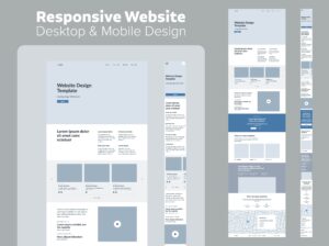
You have gone through all the exploration, ideation, and interviews, what do you do with it? Wireframes. I hear all too often wireframes are outdated and don’t matter, with tools like JustInMind you can get what you want and have it look great. But, when you start with High Fidelity Mockups inevitably, someone on the team will argue the color scheme or font. When you use Wireframes, no color, no particular font, you get absolute focus on the UX and on what really matters. Your wireframes will define your user experience better than any graphical design will. Balsamiq Wireframes is the absolute best tool for creating a User Experience based website; they even have a cloud version, to get you up and running in minutes.
The Graphic Redesign
Now that you have a user journey and can understand what they are doing, you can now design the look. When you design first and then try to implement the user experience, you will likely fail at one or the other. Taking the time to understand how it feels before how it looks will make your life and ultimately, your user’s experience that much easier.
Redefine Website Design With UX First
In today’s digital world, a website needs more than just a beautiful design—it needs a great User Experience (UX). A seamless UX guides users, keeps them engaged, and ultimately drives conversions.
- Landing Pages: First impressions are key. Design landing pages that communicate who you are immediately, using analytics and user insights to shape them.
- Call to Action: Keep CTAs clear and simple. Avoid distractions like sliders and unnecessary animations.
- Qualification: Make contact forms short and straightforward; ask only for essential details to encourage users to reach out.
- Conversion: Show users their action is complete, whether through confirmation messages or by blocking double-clicks.
How to Implement UX
Start with Wireframes before colors or fonts. Wireframes focus on function, ensuring UX elements work as intended without design distractions.
Graphic Redesign
Once the UX is mapped out, then add visual elements. A design-first approach often sacrifices UX, but putting users first creates a smoother journey. Let Lightning Workgroup guide you in building a UX-focused website that delivers real value to your users.


